simple is beautiful
Too Fat For Fashion: April 2008
2 ... 2 ...

Tuesday, April 29, 2008

Color by Technicolor: Wearing Springs Neons

I don't know about anyone else but I'm all about color right now. Not just color but the brightest most saturated brights in existence. Weeks of bronchitis and all things drab have left me eager for the full Crayola box selection. Since it is spring - and the stores are full of the latest in almost florescent color - its the perfect time to explore all that is bright and punchy. Of course we know that color this vivid can be a bit tricky so we have a little guide to navigating the dos and donts of bright colors.


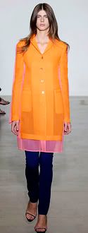
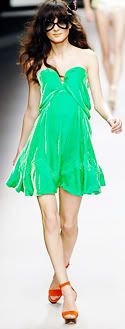
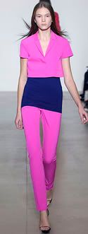
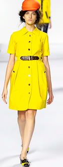
Bold Color at Jil Sander, Sonia Rykiel and Marc by Marc Jacobs


1. Keep It Simple: Neon colors pack a punch all by themselves so one can keep the patterns to a minimum. Too much pattern and color could wind up looking too loud - or worse yet too 80s if done wrong. There is a fine line between looking chic and looking like an extra from a Duran Duran video. If you absolutely must go you're going to go for a pattern make sure its balanced - the right mix of neutral and bold. You might even want to try one of the numerous Balenciaga inspired floral patterns that abound this season.

2. Adjusting the Levels: There is bright and then there is BRIGHT. Neon can be very harsh so its important to pick the right shades to flatter your skintone. In general the warmer toned brights are more universally flattering - instead of an acid yellow go for a sunnier shade. Its important to always consult a mirror before wearing bright colors because the undertones in your skin play such a role in which shades will work best.

3. Balance: Head to toe neon is best left for fashion editorials and raves. Balance out your brights with subtler colors. Neutrals are great for this but don't be afraid to experiment with unexpected color combinations. Look at how well the pale pink and bright orange combo works at Jil Sander - sometimes a pastel or muted color can work just as well as a neutral.

4. Be Fearless: Fashion magazines are filled with crap about how black is slimming and blah blah wear dark colors if you aren't size 0. Forget all that garbage. Its spring - no one wants to be dressed like they're on the way to a funeral. Color is an incredible way to stand out in a crowd - however if you do feel shy about wearing such bright colors try a bright handbag or shoes instead.
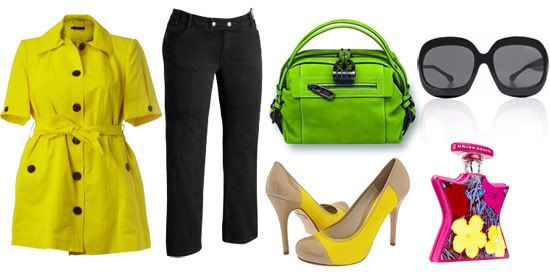

Yellow Belted Mac - Evans, Black Straight Leg Jeans - Old Navy, Green Suede Bag - Derek Lam (in stores only), Yellow & Beige Pumps - L.A.M.B., Oversized Sunglasses - Tom Ford, Andy Warhol Union Square Fragrance - Bond No. 9


Now I've put together a little outfit with a lot of color that I think shows off a wearable version of this trend. We've got a great little top from Evans, in the perfect lemon yellow shade paired with classic black jeans from Old Navy. I think this combo is just great for spring and very easy to wear. For added interest we've got an equally juicy combo of accessories - amazing colorblocked pumps from L.A.M.B. (their shoes are consistently offbeat quirky) and an apple green suede bag from Derek Lam. Notice that the top and shoes are yellow but the bag is green - you don't want to do all one color its good to have a bit of difference to mix things up. Top it all off with a pair of over the top Tom Ford sunglasses and a spritz of Bond No. 9's latest pop art fragrance and you're good to go.

Will you be wearing bright colors this spring or are you planning on skipping this trend? I've already started up on it to be honest and I don't plan on stopping until the weather cools down.

Friday, April 18, 2008

Illustrating a point

With illustration such a big trend this spring (check out UK Vogue's round-up of illustrated cosmetics' packaging, and, duh, Prada's drool-worthy Flower Faerie collection), I couldn't, Carrie "Now On the Big Screen and Thus Totally Relevant in 2008" Bradshaw-style, help but wonder: do fashion's illustrations influence the size debate?

One of the most oft-cited idiotic excuses designers use to defend their choice of wafer-thin models on the catwalks, is some variation on the "curves – breasts and thighs and rounded bits - ruin the line of the clothes"/"the design was perfect on paper, it gets distorted by breasts" etc.

What they're talking about is how the ideal of the design, on paper, works differently when translated into fabric and placed on a real body. Inevitably, when one designs in a 2D paper format, the final result will be different. You're going from a painting to an object. Yet, rather than accept that the finished piece (a dress, skirt, trouser, what have you), is the real design, and the original illustration is merely a piece of artistic whimsy, designers all too often cling to the illustration as the perfect realisation of the design, with the clothing itself a poor facsimile of what could have been.

In a sane world, we would shake our heads and say, "But isn't the point of designing clothes to design, well, clothes? So if you can't design a dress on paper that works well when made, you're not very good at your job. And if you only want to design dresses on paper, go off and be a painter, or a full-time illustrator."

But this is fashion. So instead, as we've seen, we blame the models for distorting the design/ruining the line/stretching the fabric. That's not exactly what I want to examine here: we've discussed designers' wacky views of women's bodies on the catwalk fairly often; let's now move the discussion over to how they imagine women's bodies.

Ever noticed that the women in fashion illustrations have something in common, both with each other, and with catwalk models? Let's take a look:


Ceci n'est pas des femmes


Aside from the issues of race (seriously, where are the non-Caucasian fashion illustrations? Is there some massive shortage of brown ink that we don't know about?), the distortions of illustrated women's bodies are just insane.

It's no wonder designers see a difference between their designs as idealised on paper, and the finished product. It's one thing to add a dash of fantasy to illustrations - they are, after all, an artwork in themselves. But they should be secondary to the real deal, secondary to the reason those illustrations exist in the first place: the clothes.

Yet designers persist in cladding imaginary girls thinner than the paper they're drawn on. I'd love to see the illustrations done by plus designers: Anna Scholz, Marina Rinaldi, et al. Do they, too, whisk their pencil and conjure whippet-thin women, or are their drawings more closely related to the end product?

Do these illustrations matter? Should we concentrate solely on real women, on getting plus-sized models into the magazines and onto the catwalks alongside their thinner colleagues, rather than distracting ourselves with the semantics of cartoons?

I think it matters. Because when you write, or draw, you have absolute freedom. There isn't a client saying, "customers won't respond to an advert with a black model"; or a stylist saying, "fat chicks won't fit into these sample sizes". There aren't real-world, financial implications. Unless you're drawing to commission from a fashion magazine, in which case, are the magazines specifiying "thin imaginary models only, please - and make them white"?

There's just paper, pencil, and imagination. Every race, height, hair colour, size is at your disposal when you illustrate. And yet, even when there are no limits, all we see is thin.

Saturday, April 12, 2008

"Tonight, Matthew, I'm going to be..."

Who wasn't in love with the star prints shown by The Kaiser at Chanel, and Stefano Pilati at Yves Saint Laurent, this season? So 1920s Americana, so patriotic, so red white and blue, so "let's do it for our country!" "Oh, Lewis!"...*

The answer to this mostly rhetorical question is, of course, NOBODY. The world has gone star(k) staring mad. (See what I did?!) London's Oxford Street-Regent Street high-street hub has turned into the MGM of yesteryear: more stars than there are in the heavens. Yet as the lights go out all over Europe, I forget about all Hollywood, because Doris Day could never make me cheer up, quite the way those French girls always could the high-street, usually a place (state of mind?) I am likely to pledge my firstborn unto for ripping off catwalk looks at lemonade prices, has, on this occasion, GONE TOO FAR.

STARS ARE EVERYWHERE. IT'S FREAKING ME OUT.

But, and yet. I still love the star prints. How can one not? It's spring! (Allegedly.) What could be funner and flirtier than a navy, star-printed shortie jumpsuit and a pair of fabulous sunglasses? Unfortunately, not only does everybody else love the look, it ain't subtle. If three lasses all wear jumper dresses to the same bar, no-one would know. Three of you wear a star-print -- even in wildly varying forms, a jumpsuit here, a cardigan there -- oh, the jokes will never end. Yet there is still, to quote Heaven 17: temptation.

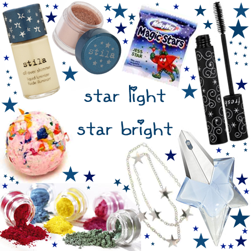
Here's how to indulge in the trend without going starry-eyed:


Clockwise from top left:
Stila All-Over Liquid Shimmer, $22 from Stila.com
Stila All-Over Shimmer Eyes in #7, Champagne, $18 from Stila.com
Magic Stars, £0.44 from Sweetiebag.com
Fresh Supernova Mascara, $25 from Sephora.com
Angel by Thierry Mugler, $45 from Sephora.com
Silver Star Chain, $9.99 from GirlProps.com
Barry M Dazzle Dusts, £4.50 from Superdrug.com
Champagne Supernova Bath Bomb, £2.65 from Lush.co.uk


If that little lot isn't ample sufficiency, well...why not have a read of the excellent Star, and its even better sequel, Star Struck, by noted author Pamela Anderson?

*Quick poll: who was hotter -- Lewis from Grease 2, or Kenickie from Grease? Or has Jeff Conaway's latterday behaviour/appearance negated all Kenix hotness forever? One to ponder...

LABEL